Best 5 Tools for Professional Responsive Web Design
The Hidden Dangers of Non-Responsive Websites
In today’s fast-paced, mobile-driven world, having a website that isn’t responsive or mobile-friendly is more than just a missed opportunity—it’s a liability. Imagine your potential customer, eager to learn more about your services, landing on your website only to be greeted by text too small to read, images that don’t load properly, and buttons that are impossible to click on a mobile screen. Frustration sets in, and before you know it, they’ve left your site for one of your competitors.
This is the reality for businesses that haven’t embraced responsive website design. A non-responsive site can lead to:
- Poor User Experience: Visitors struggle to navigate, leading to frustration.
- Lower SEO Rankings: Google favors mobile-friendly sites, meaning yours could be pushed down in search results.
- Lost Sales Opportunities: If your website doesn’t function on mobile, you lose potential customers who are ready to engage.
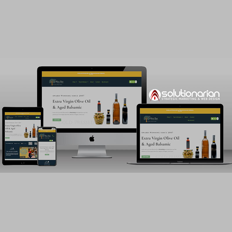
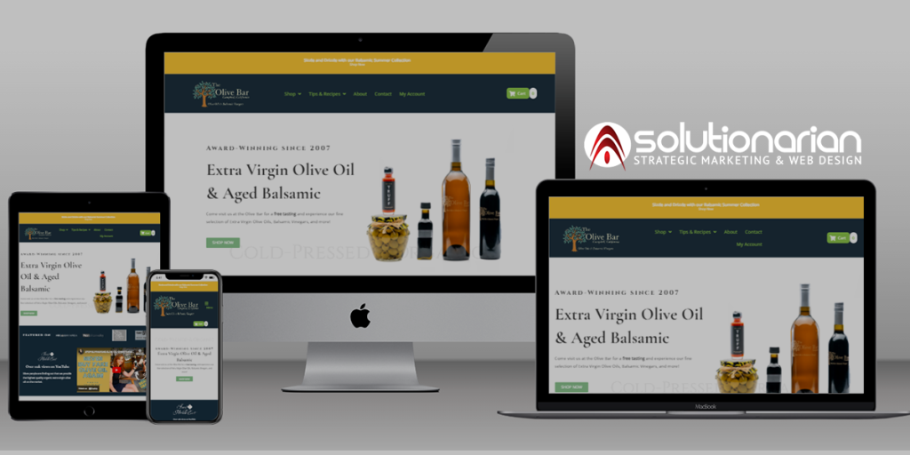
But the good news? It doesn’t have to be this way. At Solutionarian Marketing & Web Design, we’ve been designing high-quality, responsive websites since 2010, helping businesses create seamless user experiences across all devices.
Solutionarian’s Responsive Design Approach
Our team at Solutionarian Marketing & Web Design understand the frustration of users that are trying to visit a website on their mobile devices, but the website isn’t optimized for their device. Most visitors abandon their searches to go with a competing website that has a better mobile experience. We take careful measure and consideration when designing a website. These 5 tools are our favorite for creating a great mobile user experience. Here’s how we do it:
Our Responsive Website Design Tools:
Elementor
Elementor is our go-to WordPress page builder for creating pixel-perfect, responsive websites. Its user-friendly drag-and-drop interface allows us to craft custom layouts that automatically adjust to screen size. We can preview how your website will look on desktops, tablets, and mobile devices, ensuring a consistent experience for every user. The level of detail Elementor allows web designers customize for both tablets and mobile phones is commendable, allowing us to tailor each website for with the best graphics and content to enhance the mobile experience.Figma
Figma is a powerful design tool that allows our team to collaborate seamlessly in real-time. When designing responsive websites, Figma’s flexibility lets us prototype and adjust designs based on specific screen sizes and devices. This ensures we catch potential issues before development begins, saving time and resources. Figma is flexible tool that can be integrated in many website platforms for a smooth transition from wireframe to visual builder.Google’s Lighthouse
Performance is just as important as design. Google’s Lighthouse is an essential tool we use to audit websites for responsiveness, speed, and SEO readiness. By identifying areas for improvement, we can fine-tune websites to ensure they load quickly and perform efficiently on all devices, boosting both user experience and search engine rankings. There are many ways to audit your website for mobile responsiveness, but it always best to start with a service from Google.BrowserStack
When it comes to testing, BrowserStack (https://www.browserstack.com/responsive) allows us to simulate real-world device conditions across a wide variety of smartphones, tablets, and desktops. We ensure your website looks flawless and functions smoothly, no matter what device or browser your visitors are using. This is just one of those must use tools to ensure quality rendering of your website on the most popular mobile devices without having to purchase these devices.MOZ Mobile Site Audit Checklist
To further ensure mobile optimization, though our team doesn’t need to use this tool often, we thought it would be good to put in here for a point-of-reference. We believe this can help you develop a great responsive web design. MOZ Mobile Site Audit Checklist (https://moz.com/blog/mobile-site-audit-checklist) is a step-by-step guide helps you ensure your site adheres to mobile best practices, from page speed optimization to avoiding intrusive pop-ups. This checklist is packed with great resources and information to help you formalize your process in creating responsive website pages.
Why Trust Solutionarian Marketing & Web Design?
With over a decade of experience in web design, we’ve helped businesses adapt to the digital landscape by creating responsive websites that not only look great but perform flawlessly across devices. Since 2010, our team has been at the forefront of responsive design, staying ahead of trends and using the most advanced tools to provide the best user experience possible.
We know that a non-responsive website is more than an inconvenience—it can hurt your business. That’s why we’re committed to delivering websites that not only attract visitors but keep them engaged, leading to more conversions and a better return on your digital investment.
The Bottom Line: A Responsive Website is Essential
If your website isn’t responsive, you’re leaving money on the table. At Solutionarian Marketing & Web Design, we’re here to make sure your business doesn’t miss out on valuable opportunities. With our advanced tools and years of experience, we create websites that look amazing, work effortlessly, and help your business grow.
Let us guide you through the process, so you can focus on what you do best—running your business. Contact us today to get started on building a responsive website that sets you apart from the competition.
Recent Posts
How to Design a Website That Converts Visitors With Integrated Automation
How to Keep Your Santa Clara Business Competitive with SEO in 2025
Helpful Links
Local Website Designer Near Me - Nearby
- Website Designer Campbell, CA
- Website Designer Cupertino, CA
- Website Designer Gilroy, CA
- Website Designer Los Altos, CA
- Website Designer Los Gatos, CA
- Website Designer Milpitas, CA
- Website Designer Morgan Hill, CA
- Website Designer Mountain View, CA
- Website Designer Palo Alto, CA
- Website Designer San Jose, CA
- Website Designer Santa Clara, CA
- Website Designer Saratoga, CA
- Website Designer Stanford, CA
- Website Designer Sunnyvale, CA
- Website Designer Alameda, CA
- Website Designer Berkeley, CA
- Website Designer Castro Valley, CA
- Website Designer Dublin, CA
- Website Designer Fremont, CA
- Website Designer Hayward, CA
- Website Designer Newark, CA
- Website Designer Oakland, CA
- Website Designer Pleasanton, CA
- Website Designer San Leandro, CA
- Website Designer Union City, CA
- Website Designer Belmont, CA
- Website Designer Burlingame, CA
- Website Designer Daly City, CA
- Website Designer East Palo Alto, CA
- Website Designer Foster City, CA
- Website Designer Half Moon Bay, CA
- Website Designer Menlo Park, CA
- Website Designer Millbrae, CA
- Website Designer Pacifica, CA
- Website Designer Redwood City, CA
- Website Designer San Bruno, CA
- Website Designer San Carlos, CA
- Website Designer San Mateo, CA
- Website Designer South San Francisco, CA