The Essential Guide to Responsive Web Design
Responsive Web Design is essential in today’s digital world, where your website’s success hinges on its performance across multiple devices. With users browsing on smartphones, tablets, laptops, and desktops, having a responsive website is not just a nice-to-have—it’s a necessity. This guide walks you through the essentials of responsive web design, covering best practices, challenges, tools, and the potential pitfalls if you neglect this critical aspect.

- Home
- Website Design
- The Essential Guide to Responsive Web Design
Our Guide on Website Design Basics
Our Guide to Understanding Responsive Web Design
This guide provides a comprehensive overview of Responsive Web Design, detailing its importance in today’s multi-device digital landscape. Readers will learn:
- The Basics: Understand what responsive web design is and why it’s essential for creating websites that function seamlessly on desktops, tablets, and smartphones.
- Best Practices: Discover proven strategies like mobile-first design, flexible grids, and media queries, along with practical tips for implementing them effectively.
- Challenges and Solutions: Gain insights into common obstacles, such as optimizing navigation and performance, and learn how to overcome them using modern frameworks and tools.
- Impact on User Experience and SEO: Explore how a responsive site enhances user engagement, improves search engine rankings, and boosts your website’s visibility and profitability.
- Useful Tools: Familiarize yourself with top design and development tools like Figma, Bootstrap, and BrowserStack to streamline the process and ensure success.
This guide is crucial for anyone looking to optimize their website for all devices, ensuring a consistent and engaging experience for users. Whether you’re a web designer, developer, or business owner, you’ll gain valuable knowledge and actionable tips to improve site performance, increase traffic, and maximize conversions. Don’t risk losing potential customers and revenue—learn how to make your site responsive today!
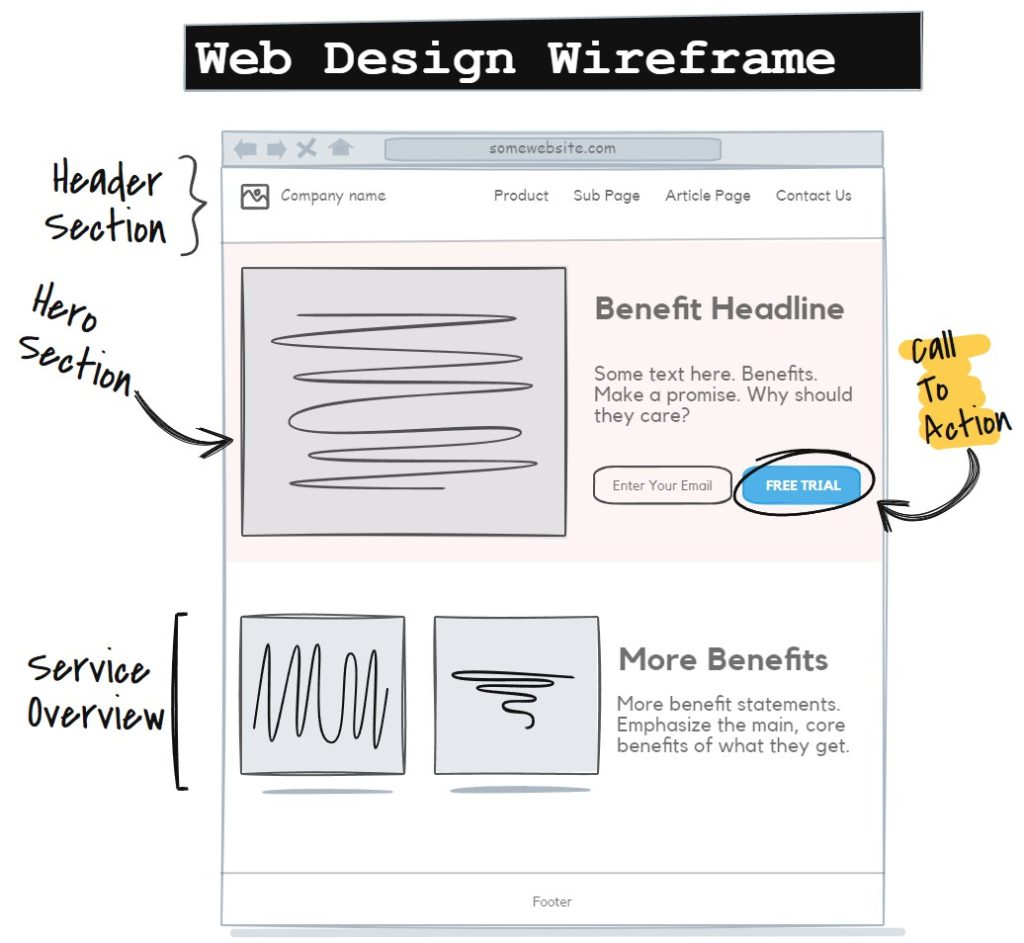
What Is Responsive Web Design?
Responsive web design ensures that your website adapts seamlessly to any device or screen size. This means that no matter if your visitors are on a desktop, tablet, or smartphone, your site remains user-friendly and fully functional. It’s about creating a flexible, fluid layout that scales and adjusts based on the screen’s dimensions, providing an optimal viewing experience.
Example of a Good Responsive Design:
A site that adjusts font sizes, images, and layouts when moving from a desktop screen to a mobile device, ensuring all content remains accessible and readable.


Example of a Bad Responsive Design:
A website that looks perfect on a desktop but requires pinching and zooming on mobile devices, resulting in frustrated users who may leave the site quickly.
Why Responsive Design Matters
Not having a responsive website can lead to significant consequences. Let’s break down why responsive design is crucial:
Impact on User Experience
- Problem: Users accessing non-responsive websites often struggle to navigate, read content, or interact with site features.
- Consequence: Poor user experience drives visitors away, leading to lost traffic and potential sales.
- Loss Analysis: The cost of a high bounce rate (users leaving your site quickly) means reduced conversion opportunities and lost revenue over time.
Impact on SEO and Visibility
- Problem: Search engines like Google prioritize mobile-friendly websites. If your site isn’t responsive, it may not rank well.
- Consequence: Fewer visitors from search engines, resulting in lower organic traffic and visibility.
- Loss Analysis: Not appearing on the first page of Google for your target keywords directly impacts your bottom line and future growth potential.
Cost of Fixing Issues Later
- Problem: Retrofitting a non-responsive website can be time-consuming and costly.
- Consequence: Extra expenses and potential downtime, leading to further loss of business.
- Loss Analysis: Investing in responsive design upfront saves money and time compared to revamping an outdated site.
Best Practices for Responsive Web Design
To build a website that works well across all devices, you need to follow these tried-and-true practices:
Mobile-First Design
- Tip: Start designing with the smallest screen in mind (mobile) and gradually enhance for larger devices.
- Example: Prioritize essential elements like your logo, navigation, and call-to-action buttons for mobile users first. If your mobile version is clear and functional, scaling up becomes easier.
- What Not to Do: Designing only for desktop and hoping it looks fine on mobile. This approach often results in a cluttered, unusable mobile experience.
Use of Flexible Grids and Layouts
- Tip: Leverage CSS frameworks such as Bootstrap and Tailwind CSS for flexible grid systems that automatically adjust layouts based on screen sizes.
- Example: Bootstrap’s 12-column grid allows you to create responsive designs efficiently.
- What Not to Do: Hardcoding fixed pixel values for layouts; this restricts flexibility and can break your design on smaller screens.
Media Queries for Adaptability
- Tip: Implement CSS media queries to adjust styles based on the device’s characteristics like screen width or orientation.
- Example: A media query might adjust font sizes and image dimensions when a screen width goes below 768 pixels.
- What Not to Do: Overloading your stylesheet with media queries can become complex. Instead, keep them organized and specific to crucial elements.
Responsive Web Design Challenges and Solutions
Responsive web design comes with its challenges, but being prepared can help you overcome them effectively.
Handling Complex Navigation Menus
- Problem: Complex menus may not translate well to smaller screens.
- Solution: Implement a mobile-friendly menu like a hamburger icon that expands when clicked. Frameworks like Bootstrap have built-in solutions for this.
- What Not to Do: Using the same dropdown or multi-tier menu designed for desktops without simplifying it for mobile users.
Optimizing Performance Across Devices
- Problem: Larger images and resources designed for desktops can slow down mobile load times.
- Solution: Use responsive images (e.g.,
srcsetattribute in HTML) and lazy loading techniques to reduce load times. Tools like Google’s PageSpeed Insights can help identify and fix performance issues. - What Not to Do: Ignoring image optimization; large files negatively impact page speed and user experience.

Design Tools to Get It Right
Several tools and frameworks can make building a responsive site easier and more efficient:
Design and Prototyping Tools
- Figma: Create interactive prototypes that showcase how your design will adapt to different devices.
- Adobe XD: Offers responsive design tools and layout grids to visualize how content flows.
- Tip: Always test prototypes on various screen sizes before moving to development.
Development Frameworks
- Bootstrap and Tailwind CSS: Popular CSS frameworks that provide pre-built responsive components.
- Tip: Familiarize yourself with these frameworks to save time and ensure consistency across devices.
Testing Tools
- Google’s Mobile-Friendly Test: Check your site’s mobile compatibility instantly.
- BrowserStack: Test across multiple devices and browsers.
- Tip: Regularly test your site during development to catch issues early.

Common Issues With Non-Responsive Websites
If your website is not responsive, here are the common problems you’ll face:
Increased Bounce Rates and Lost Traffic
- Non-responsive sites often frustrate users, causing them to leave quickly. This not only leads to lost potential sales but also damages your SEO performance.
Poor User Experience
- A site that looks good on desktop but doesn’t adjust for mobile devices creates a poor experience for users. This can lead to negative reviews, reduced credibility, and a drop in return visits.
Long-Term SEO Impacts
- Sites that aren’t optimized for mobile risk being deprioritized by search engines like Google, leading to long-term impacts on traffic and visibility.
Responsive website design is not just a trend—it's a necessity for any business looking to succeed in today's competitive digital landscape. A well-designed, mobile-friendly site ensures that you capture every opportunity, keeping users engaged and driving conversions.
At Solutionarian Marketing & Web Design, we pride ourselves on being the best choice for responsive web design. Our expertise and commitment to delivering results make us the partner you can trust to build a high-performing website tailored to your business needs. We invite you to meet with us for a consultation and a personalized quote.
Let’s work together to create a website that sets your business apart and maximizes your online potential.
Need a Website Designer That Can Serve Your Area?
We can serve you no matter where you are, we are just a phone call or Zoom Web Conference away.
Here are some of the areas we serve our clients: Explore Local Service Area
- Santa Clara Website Design
- San Jose Website Design
- Campbell Website Design
- Milpitas Website Design
- Palo Alto Website Design
- Sunnyvale Website Design
- Los Gatos Website Design
- Cupertino Website Design
- Saratoga Website Design
- Mountain View Website Design
- Morgan Hill Website Design
- Gilroy Website Design
- Los Altos Website Design
- Stanford Website Design
- Oakland Website Design
- Fremont Website Design
- Hayward Website Design
- Berkeley Website Design
- San Leandro Website Design
- Pleasanton Website Design
- Alameda Website Design
- Union City Website Design
- Castro Valley Website Design
- Dublin Website Design
- Newark Website Design
- San Lorenzo Website Design
- Daly City Website Design
- San Mateo Website Design
- Redwood City Website Design
- S. San Francisco Website Design
- San Bruno Website Design
- Pacifica Website Design
- Menlo Park Website Design
- Foster City Website Design
- Burlingame Website Design
- San Carlos Website Design
- East Palo Alto Website Design
- Belmont Website Design
- Millbrae Website Design
- Hollister Website Design
- Monterey Website Design
- Santa Cruz Website Design
- Paso Robles Website Design
- Los Angeles Website Design