Website Design Basics
At Solutionarian Marketing & Web Design, we are dedicated to delivering exceptional website design services that blend creativity, technology, and strategy. With over a decade of experience, our commitment goes beyond just building visually appealing sites—we focus on creating functional, user-friendly platforms that drive results. We understand the importance of a strong online presence, which is why we’ve created this comprehensive guide on Website Design Basics. Our goal is to educate and empower our readers, giving them the foundational knowledge they need to understand and navigate the dynamic world of web design.
- Home
- Website Design
- Website Design Basics
Our Guide on Website Design Basics
Introduction to Website Design
Website design, or sometimes referred to as just “web design”, is the art and science of creating visually appealing and functional websites. It combines aesthetics with technology to build user-friendly interfaces that help businesses achieve their online goals. Did you know that 94% of first impressions relate to a website’s design? (Source: Stanford Web Credibility Research). This statistic underlines why web design is crucial for engaging users and building credibility.
What is Web Design?
Web design is the practice of planning and organizing content for a website to create an engaging and accessible online platform. It involves both creative and functional elements, determining the visual aspects—like colors, typography, and images—as well as the structure and user interface of a site.
With the increasing need for businesses and individuals to establish a digital presence, web design has become an essential part of online strategy. It’s a dynamic field, evolving continuously to include new technologies and mobile-first designs that cater to the growing expectations of users.
Web design often involves collaboration across various fields, including SEO, user experience (UX), and digital marketing. Web designers work with experts in these areas to optimize site performance, ensuring the website not only looks appealing but also functions efficiently and meets specific business goals.
Importance of Web Design
A well-designed website is crucial for establishing credibility and engaging users. Research shows that 94% of first impressions are design-related, meaning your website’s visual appeal and usability play a significant role in how visitors perceive your brand. A thoughtfully designed site not only attracts users but also keeps them engaged, ultimately leading to higher conversion rates and better overall business performance.
Website Design Tools
Web design tools are essential for creating professional, user-friendly websites efficiently. The right toolset can make the design process faster and more intuitive.
Essential Web Design Software
Programs like Adobe XD, Figma, and Sketch are industry standards for wireframing and prototyping. In fact, over 60% of professional designers use Figma due to its collaborative capabilities (Source: Figma User Research).
Code Editors and Frameworks
Popular code editors like Visual Studio Code simplify the coding process with built-in features. Frameworks such as Bootstrap and Tailwind CSS help designers build responsive, modern sites quickly.

HTML Basics
HTML (HyperText Markup Language) forms the backbone of web pages. Without it, you wouldn’t be able to structure and display content effectively. Learning HTML is your first step toward becoming a proficient web designer.
Building Simple Webpages
HTML allows you to create basic elements like headers, paragraphs, and links. According to W3Techs, 86.2% of all websites use HTML5, the latest version, due to its flexibility and support for multimedia integration.
CSS Fundamentals
CSS (Cascading Style Sheets) is what makes websites look attractive and visually engaging. It helps you style and format the elements that HTML structures.
Styling Techniques
CSS allows designers to manipulate colors, spacing, and fonts to align with brand aesthetics. For instance, using Google Fonts—used by 52% of all websites—can significantly enhance the visual appeal while maintaining fast load times (Source: W3Techs).
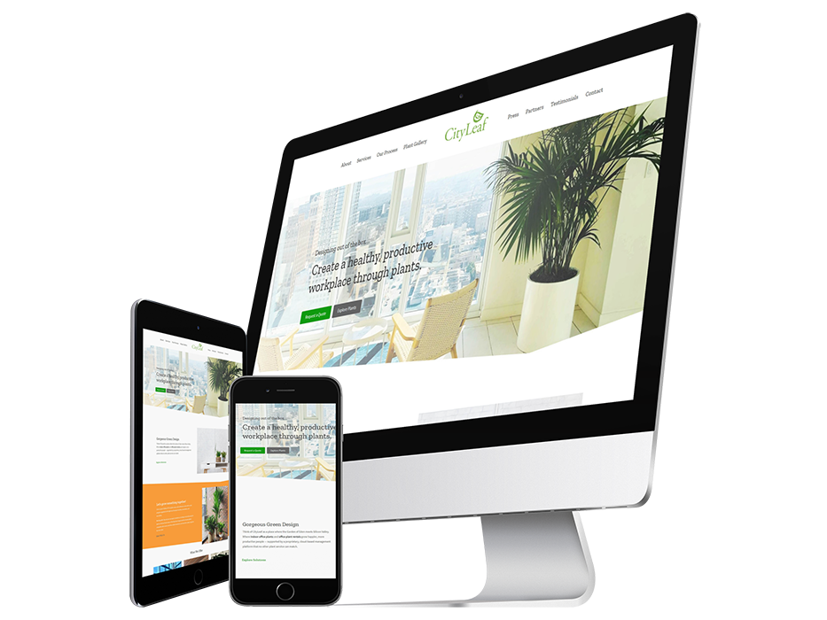
Responsive Design
Responsive design ensures that your website works seamlessly across devices—desktops, tablets, and smartphones. As mobile traffic accounts for over 54.8% of global web traffic (Source: Statista), designing mobile-first is no longer an option but a necessity.
Mobile-First Design Approach
A mobile-first approach prioritizes mobile user experience and scales up for larger screens. This method aligns with Google’s mobile-first indexing, which can significantly boost your site’s SEO performance.
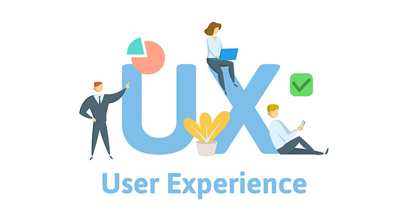
UX (User Experience) Design
User Experience (UX) design is all about creating intuitive, efficient, and enjoyable interactions for users. In web design, UX focuses on understanding user needs, behaviors, and motivations.
Creating User Journeys and Personas
Creating user personas and mapping out journeys helps designers tailor the site to the target audience. Websites that focus on UX design can see conversion rates increase by up to 400% (Source: Forrester Research).

UI (User Interface) Design
While UX focuses on functionality, User Interface (UI) design deals with the visual elements users interact with. It’s essential for ensuring that a website not only functions well but looks appealing too.
Common UI Patterns Utilizing familiar UI patterns such as navigation bars and call-to-action buttons helps users navigate efficiently. Research shows that 76% of users prioritize ease of use over aesthetic appeal (Source: User Testing).
Web Typography
Typography is a key element in web design that significantly influences how users perceive and interact with a website. The choice of fonts and their implementation can impact readability, visual hierarchy, and the overall aesthetic of a site. Beyond just choosing a style, typography helps communicate a brand’s personality and tone.
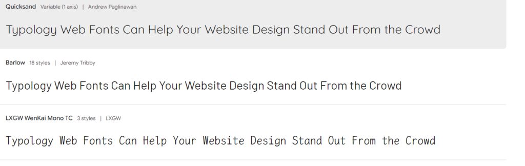
Google Fonts, Adobe Fonts, and Custom Fonts
Google Fonts: Google Fonts is one of the most popular free resources for web typography, offering a vast library of open-source fonts that are easy to integrate. Google Fonts is used by over 52% of websites globally (Source: W3Techs). Its popularity is due to the platform's accessibility, fast loading times, and the wide variety of styles available to fit different design needs. By optimizing for performance, Google Fonts helps ensure that typography doesn’t slow down page load times, which is crucial for user experience and SEO.
Adobe Fonts: Adobe Fonts (formerly Typekit) is another powerful option, particularly for professional designers seeking a diverse range of high-quality fonts. It offers premium and unique typefaces not available elsewhere, making it ideal for brands looking to establish a distinctive visual identity. Adobe Fonts integrates seamlessly with design software like Adobe XD and Photoshop, providing more creative flexibility. Its focus on responsive and optimized typography ensures that websites using Adobe Fonts maintain consistency across devices and screen sizes.
Custom Fonts: Many brands choose to develop or use custom fonts to set themselves apart from the competition. Custom fonts can elevate a brand's presence by providing a unique and memorable visual style. However, using custom fonts requires careful optimization to prevent slow load times, which can negatively affect user experience. Implementing custom fonts often involves using technologies like WOFF (Web Open Font Format) or services such as Font Squirrel to ensure compatibility and efficiency.
Impact on Web Design
The choice of fonts—whether from Google, Adobe, or custom-made—can influence the overall user experience significantly. Well-chosen typography improves readability, guides the user’s eye through the content, and enhances the site’s aesthetic appeal. For example, pairing contrasting fonts (e.g., a bold headline with a clean, sans-serif body font) helps establish a clear visual hierarchy, making information easy to digest.
Additionally, the performance impact of fonts is critical. Poorly optimized or overly decorative fonts can slow down a site, leading to higher bounce rates. Studies show that 53% of mobile users abandon sites that take longer than three seconds to load (Source: Google). Therefore, selecting web-optimized fonts from resources like Google or Adobe helps balance design and performance, ensuring the site remains visually appealing and fast-loading.
Best Practices
Readable and accessible typography can improve site retention rates. Studies reveal that 60% of users will not return to a website if the text is unreadable on their device (Source: Awwwards).
Color Theory in Web Design
Colors evoke emotions and set the tone for a website. Understanding how to use color theory effectively can enhance user experience and brand recognition.
Applying Colors to Web Design Utilizing complementary colors and ensuring adequate contrast improves accessibility. With 8% of men and 0.5% of women affected by color blindness (Source: Color Blind Awareness), ensuring your site is visually accessible is crucial for inclusivity.

Grid and Layout Systems
A structured layout is essential for building organized and visually appealing websites that deliver a seamless user experience. Grids provide the underlying structure for positioning elements, making it easier to create balanced, consistent designs. Popular layout systems like CSS Grid and Flexbox have revolutionized web design by allowing designers to build responsive, adaptable layouts efficiently and effectively.
CSS Grid and Flexbox
- CSS Grid is a two-dimensional system that provides a flexible way to align and distribute space across the grid, both vertically and horizontally. It’s perfect for creating complex layouts, like multi-column designs, that automatically adjust to various screen sizes.
- Flexbox, on the other hand, is a one-dimensional system designed for laying out elements in either a row or column, making it great for building simpler, yet dynamic, components such as navigation menus or card layouts.
By combining these tools, designers can create fluid and responsive designs that dynamically adapt to different devices, enhancing both the site’s aesthetics and its functionality. In fact, 74% of designers report improved efficiency when using CSS Grid compared to traditional layout methods (Source: CSS-Tricks).
Popular WordPress Builders Utilizing Grid and Visual Layouts
Many WordPress builders leverage grid and visual layout systems, allowing users—whether they have coding experience or not—to build responsive and attractive websites quickly. Some of the most popular WordPress builders include:
Elementor: Elementor is one of the most widely used WordPress page builders, known for its drag-and-drop interface and grid-based design approach. It allows users to create pixel-perfect layouts using rows and columns, with options for responsive adjustments. Elementor’s grid system makes it simple to control the alignment and distribution of elements for any screen size.
Divi: Divi by Elegant Themes is another powerful builder that provides a visual editor and grid-based tools to structure pages. It offers pre-made layouts that users can customize with their own content, or they can start from scratch to create unique grid designs. Divi’s responsive editing capabilities enable users to see and adjust how their design looks on desktop, tablet, and mobile devices in real-time.
WPBakery Page Builder: Formerly known as Visual Composer, WPBakery offers a front-end and back-end editor that makes use of grids and column-based layouts. Users can easily arrange elements and customize layouts visually, with options to adjust the responsiveness of grids based on device type.
Beaver Builder: Beaver Builder is a reliable and intuitive page builder that uses a visual, grid-based system to create responsive designs. It offers drag-and-drop features with predefined column structures, making it easy to build pages that look good on any device without writing any code.
Gutenberg: Gutenberg, the default block editor for WordPress, incorporates a grid-like approach through its block-based system. Users can stack and arrange content blocks to form various layouts and use built-in column and grid blocks to structure their pages. It’s a great option for beginners looking for a simple, grid-based design tool integrated directly into WordPress.
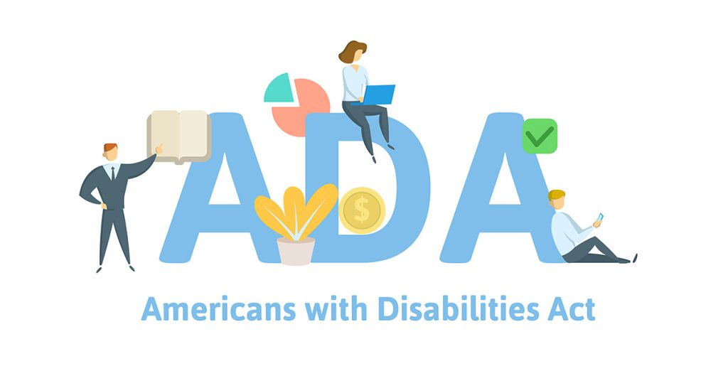
Web Design Accessibility
Designing accessible websites is not only ethically right but also can be legally required. The ADA (Americans with Disabilities Act) mandates accessibility features for web pages to cater to all users.
Accessibility Best Practices Incorporating alt text for images and using semantic HTML improves accessibility and SEO. Websites optimized for accessibility can reach more than 20% of the population with disabilities (Source: CDC).
SEO for Web Designers

Understanding SEO (Search Engine Optimization) is essential for web designers because it ensures that websites not only look great but also rank well in search engine results, driving organic traffic and visibility. Given that 68% of online experiences start with a search engine (Source: BrightEdge), integrating SEO best practices into web design is critical to building websites that perform well and reach their target audience.
On-Page SEO Considerations
On-page SEO involves optimizing elements within the website itself to enhance visibility and ranking potential. For web designers, this means focusing on the structure, content, and code of the website. Here are a few key on-page SEO factors designers should prioritize:
- Title Tags and Meta Descriptions: Ensuring each page has a unique, descriptive title tag and meta description that incorporate relevant keywords helps search engines understand the page's content and encourages users to click.
- Heading Tags (H1, H2, H3, etc.): Proper use of heading tags organizes content hierarchically, making it easier for search engines and users to read and understand the information on a page.
- Image Optimization: Using descriptive file names and alt text for images not only improves accessibility but also gives search engines context, helping pages rank for relevant queries.
- URL Structure: Clean, keyword-rich URLs make it easier for search engines to crawl and index the content, improving search rankings and making the URLs more user-friendly.
Technical SEO Considerations
Technical SEO focuses on the behind-the-scenes elements that influence a website’s performance and search engine visibility. These aspects are critical for designers because they directly impact how a site is crawled, indexed, and displayed in search engine results. Some important technical SEO factors include:
- Site Speed: Page load time is crucial, as a 1-second delay can reduce conversions by 7% (Source: Google PageSpeed Insights). Designers can improve speed by optimizing images, minimizing CSS and JavaScript, and using techniques like lazy loading to ensure faster page loads.
- Mobile Optimization: With over 54% of global web traffic coming from mobile devices (Source: Statista), mobile optimization is non-negotiable. Responsive design and mobile-friendly interfaces ensure that sites rank well under Google’s mobile-first indexing approach.
- SSL Certificates (HTTPS): Security is an important ranking factor. Websites that use SSL (indicated by HTTPS) are prioritized by search engines. Designers should ensure SSL certificates are installed and correctly configured.
- Structured Data (Schema Markup): Structured data helps search engines understand the content of a page more accurately. By adding schema markup, designers can enhance how content is displayed in search results, improving click-through rates.
Key SEO Factors Influencing Design
For web designers, balancing SEO with aesthetic and functionality is essential. Here’s a brief list of design factors that influence SEO:
- Navigation: Designing clear, user-friendly navigation not only improves user experience but also helps search engines crawl and index important pages more effectively.
- Content Layout: Using structured layouts that prioritize important content (like above-the-fold elements) ensures that both users and search engines see critical information first.
- Image and Media Optimization: Compressing images and using modern formats (e.g., WebP) ensures that media elements don’t slow down the site. Optimizing alt text for images also helps with accessibility and SEO.
- Internal Linking: Including internal links within the design helps guide users to related content and assists search engines in understanding the site's architecture and content relationships.
- Accessibility and HTML Semantics: Proper use of HTML tags (e.g., header, footer, article) and ARIA roles not only improve accessibility but also help search engines understand the site’s structure, which can enhance ranking potential.
By incorporating these SEO practices into the web design process, designers can build sites that not only look appealing but also perform exceptionally well in search results, driving traffic and conversions.
JavaScript in Web Design
JavaScript is the programming language that brings interactivity to websites. Knowing the basics of JavaScript can enhance your skillset as a designer and allow you to create more dynamic user experiences.
Popular JavaScript Libraries Frameworks like jQuery and GSAP are used for simple animations and enhancing site functionality. JavaScript powers 97.5% of websites globally, highlighting its essential role (Source: W3Techs).

Website Design Navigation
Although we touched on this in the SEO section of this guide, it’s important to reiterate the importance of website design navigation.
Website navigation directly impacts user experience and SEO. Good navigation ensures users can find information quickly and easily.
Mobile Navigation Best Practices
With the rise of mobile users, adopting mobile-friendly navigation such as hamburger menus or sticky navigation bars can improve engagement and retention rates by 55% (Source: Clutch.co).

Web Animation Techniques
Animations add life to websites, but they must be used thoughtfully to enhance the experience rather than distract. Animations like micro-interactions guide users and make the site feel more interactive.
Enhancing User Experience with Animations
Micro-interactions such as hover effects and loading animations can improve user retention by up to 45% (Source: Smashing Magazine).
Web Design Trends
Staying updated with trends keeps your design fresh and competitive. Modern web design trends include minimalism, immersive 3D experiences, and the use of AI in design tools.
Emerging Technologies
Technologies like AI design assistance and augmented reality can transform how users interact with websites, creating more engaging experiences. 30% of businesses now utilize AI for web design efficiency (Source: Adobe).
Landing Page Design
A high-converting landing page is essential for marketing campaigns. Effective landing pages have a strong headline, visuals, and an easy-to-understand call-to-action (CTA).
Best Practices for CTAs
Strategically placed CTAs can increase conversion rates by 27% when tested and optimized correctly (Source: HubSpot).


Designing for E-commerce
E-commerce websites require specific attention to product presentation, user trust, and security. A well-designed e-commerce site can increase revenue by up to 70% (Source: BigCommerce).
User Trust and Security
SSL certificates and privacy policies build trust. Nearly 84% of users will abandon a purchase if they don’t trust the site’s security (Source: Baymard Institute).
Web Design Project Planning
Planning is crucial for a successful web design project. It involves setting clear goals, budgeting, and defining timelines.
Collaborating with Clients and Teams
Client feedback and collaboration ensure the final product aligns with expectations. 70% of project success is attributed to effective communication and planning (Source: Project Management Institute).
Portfolio Website Design

A well-structured portfolio website is essential for showcasing your skills, attracting potential clients or employers, and establishing your professional credibility. It serves as a digital resume, demonstrating not only your past work but also your approach, creativity, and technical skills. An effective portfolio site should go beyond simply displaying projects; it should include detailed case studies that highlight the design process, challenges faced, and results achieved. This demonstrates to prospective clients or employers how you think, solve problems, and deliver value.
Optimizing Portfolio Websites
SEO is as crucial for portfolio sites as it is for business or e-commerce websites. Optimizing for keywords related to your field, like “freelance web designer” or “UX design specialist,” can improve your visibility and attract organic traffic. According to Moz, optimizing image files (such as using descriptive file names and alt text) and incorporating relevant keywords can increase traffic by up to 150%, making your work more discoverable.
The Role of a Portfolio in Conversion Rate Optimization (CRO): A portfolio website isn’t just about displaying work; it’s also a powerful tool for Conversion Rate Optimization (CRO). For designers, converting visitors into clients or employers is the primary goal. A well-designed portfolio with clear calls-to-action (CTAs), such as “Contact Me” or “Book a Consultation,” guides users toward taking the next step. By strategically placing CTAs and using engaging, action-oriented language, you can boost conversion rates and turn casual visitors into paying clients.
Additionally, demonstrating results in your portfolio—such as showcasing metrics or before-and-after comparisons—provides evidence of your effectiveness and builds trust. This is particularly persuasive for potential clients who want to see the tangible impact your work could have on their business.
Google’s Helpful Content Update (HCU) and Its Impact on Portfolios
Google’s Helpful Content Update (HCU) emphasizes the importance of creating valuable, user-focused content. Portfolio websites must adhere to these guidelines by providing informative and engaging content that genuinely helps users understand your capabilities and services. Here’s how to align your portfolio with the HCU:
- Case Studies and In-Depth Descriptions: Rather than simply listing projects, include detailed case studies that walk users through your design process, methodologies, and the results achieved. This not only adds value for your visitors but also aligns with Google’s emphasis on high-quality, informative content.
- Testimonials and Reviews: Including client testimonials and reviews adds credibility to your portfolio. Google values authentic, user-generated content, and positive feedback from past clients shows you have a proven track record of delivering quality work.
- Visual and Interactive Elements: Engaging elements such as interactive demos, video showcases, or animated previews of your projects make your portfolio more dynamic and informative. By enhancing user engagement and providing useful, immersive experiences, your portfolio aligns with the goals of the HCU.
By optimizing your portfolio for SEO and CRO while adhering to Google’s content guidelines, you can create a portfolio site that not only attracts visitors but effectively converts them into clients or employers. This approach ensures your portfolio remains a powerful tool for building your career or business, generating leads, and demonstrating your professional expertise.
Choose Us To Design Your Website
At Solutionarian Marketing & Web Design, we pride ourselves on being experts in crafting high-quality, results-driven websites that not only look great but also perform exceptionally well. With years of experience and a proven track record, we understand the importance of combining aesthetics, functionality, and SEO best practices to create websites that help businesses thrive online. Whether you’re starting from scratch, redesigning an existing site, or looking to optimize your online presence, our team is here to guide you every step of the way.
Ready to bring your vision to life? Contact us today to schedule a consultation and get a personalized quote for your website project. Let’s build something amazing together—your success is our top priority!
Need a Website Designer That Can Serve Your Area?
We can serve you no matter where you are, we are just a phone call or Zoom Web Conference away.
Here are some of the areas we serve our clients: Explore Local Service Area
- Santa Clara Website Design
- San Jose Website Design
- Campbell Website Design
- Milpitas Website Design
- Palo Alto Website Design
- Sunnyvale Website Design
- Los Gatos Website Design
- Cupertino Website Design
- Saratoga Website Design
- Mountain View Website Design
- Morgan Hill Website Design
- Gilroy Website Design
- Los Altos Website Design
- Stanford Website Design
- Oakland Website Design
- Fremont Website Design
- Hayward Website Design
- Berkeley Website Design
- San Leandro Website Design
- Pleasanton Website Design
- Alameda Website Design
- Union City Website Design
- Castro Valley Website Design
- Dublin Website Design
- Newark Website Design
- San Lorenzo Website Design
- Daly City Website Design
- San Mateo Website Design
- Redwood City Website Design
- S. San Francisco Website Design
- San Bruno Website Design
- Pacifica Website Design
- Menlo Park Website Design
- Foster City Website Design
- Burlingame Website Design
- San Carlos Website Design
- East Palo Alto Website Design
- Belmont Website Design
- Millbrae Website Design
- Hollister Website Design
- Monterey Website Design
- Santa Cruz Website Design
- Paso Robles Website Design
- Los Angeles Website Design