Why Responsive Web Design Is Crucial for SEO Success in 2025
As we approach 2025, digital marketing and web development continue to evolve, and responsive design is more essential than ever. At Solutionarian Marketing & Web Design, we’ve helped businesses like A1 Septic Tank Inc., Design Miter Tile, and Paladino Painting Inc. optimize their websites with responsive design to enhance their SEO performance. With the upcoming shifts in search algorithms and continued emphasis on Google’s mobile-first indexing and EEAT (Experience, Expertise, Authoritativeness, Trustworthiness), having a responsive website is no longer a luxury—it’s a necessity.
In this updated guide for 2025, we’ll explore how responsive design impacts SEO and how to stay ahead with Google’s Helpful Content Update (HCU), which continues to reshape the digital landscape.
The Impact of Responsive Design on SEO in 2025
Responsive design remains crucial as it ensures that a website looks and performs well across all device types, from desktops to tablets and mobile phones. In 2025, search engines will continue to prioritize user experience as a key ranking factor, making responsive design more important than ever. Google’s mobile-first indexing now uses the mobile version of your website as the primary basis for indexing and ranking. If your site isn’t optimized for mobile, you’re likely to fall behind your competitors in search rankings.
Solutionarian Marketing & Web Design worked with Ingenuity Construction Group, ensuring their website was optimized with a mobile-first approach, leading to increased search visibility and better user engagement. By combining responsive design with strong SEO fundamentals, businesses like On Point Plumbing have also seen significant boosts in both local and organic search results.
Enhanced User Engagement for Better SEO Results
A key reason why responsive design improves SEO is the impact it has on user engagement. When your website adapts to all screen sizes seamlessly, users are more likely to stay longer, interact with the content, and convert into customers. Positive engagement metrics—such as time spent on site, page views per session, and lower bounce rates—are signals that search engines use to rank your website.
For example, when we optimized New Pipes Inc’s website, the improved responsiveness led to lower bounce rates and higher conversion rates. This resulted in better SEO performance, as Google recognized the site’s relevance and usability, aligning it with Google’s EEAT principles.
EEAT and Google’s Helpful Content Update (HCU) in 2025
As Google’s Helpful Content Update (HCU) continues to prioritize websites offering valuable, user-centered content, responsive design must be paired with a strong focus on EEAT. Google wants to see that your website demonstrates experience, expertise, authority, and trustworthiness across all pages and devices.
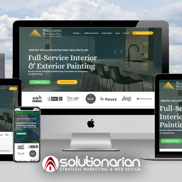
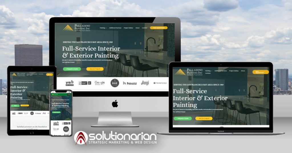
In 2025, content that fails to meet user expectations will struggle, even if the technical SEO is strong. This is why Solutionarian Marketing emphasizes creating EEAT-compliant content that works seamlessly on mobile, tablet, and desktop. We helped Paladino Painting Inc. develop content that showcased their industry expertise while ensuring it was responsive, fast, and optimized for search engines.
Responsive Design Essentials for 2025: Core Elements and Challenges
Building a responsive website involves several key elements:
- Flexible Layouts: These use grid systems and proportional units to adapt seamlessly across devices.
- Flexible Images: Ensuring images resize without losing quality, no matter the screen size.
- Media Queries: Using CSS to apply different styles based on the screen’s width and orientation.
One of the biggest challenges in 2025 is maintaining site speed and performance across all devices. Solutionarian Marketing addresses this by using tools like Google’s PageSpeed Insights and Mobile-Friendly Test to ensure fast load times while maintaining an excellent user experience. Whether it’s a complex, content-rich site like Landavaso or a visually driven website for The Olive Bar, we ensure responsiveness and performance remain top priorities.
Tools and Resources to Support Responsive Design in 2025
In addition to responsive themes and frameworks, several tools can help ensure your website is optimized for both SEO and user experience. At Solutionarian Marketing, we rely on:
- WordPress for flexible and responsive theme development
- Elementor and Figma for intuitive, user-friendly design
- Google’s Mobile-Friendly Test and PageSpeed Insights for testing and optimization
- BrowserStack to ensure cross-device and cross-browser compatibility
These tools, combined with our deep expertise, allow us to build websites that not only look good but perform exceptionally well in search results.
The Role of Responsive Design in Your 2025 SEO Strategy
Incorporating responsive design into your overall SEO strategy is more important than ever in 2025. When Solutionarian Marketing helped Ingenuity Construction Group and The Olive Bar, we didn’t just focus on responsiveness—we integrated it with keyword research, on-page optimization, and local SEO. This holistic approach ensures that your website remains competitive, drives traffic, and converts visitors into customers.
Responsive design will continue to be a significant ranking factor, especially with Google’s focus on mobile-first indexing. Ensuring a smooth and consistent user experience across all devices will help improve your website’s engagement metrics, which in turn positively impacts SEO.
With Google’s mobile-first indexing, mobile design remains the priority. However, a balanced approach that ensures a high-quality experience on both mobile and desktop devices is essential for maximizing SEO success.
You can use tools like Google’s Mobile-Friendly Test and PageSpeed Insights to evaluate your website’s mobile performance. Additionally, BrowserStack allows you to test your site across various devices and browsers to ensure compatibility.
Build for 2025 with Solutionarian Marketing & Web Design
Responsive website design will continue to be a cornerstone of SEO success in 2025. By partnering with Solutionarian Marketing & Web Design, businesses like Ingenuity Construction Group, R & R Refrigeration, and A1 Septic Tank have reaped the benefits of improved user experience, higher search rankings, and increased conversions.
Combining responsive design with SEO strategies aligned with EEAT and Google’s Helpful Content Update, we can help you stay ahead of the competition. Ready to optimize your website for 2025?
Contact us today for a free consultation and start the new year with a winning digital strategy.
Recent Posts
10 Common Responsive Web Design Mistakes (And How to Fix Them!)
Helpful Links
Local Website Designer Near Me - Nearby
- Website Designer Campbell, CA
- Website Designer Cupertino, CA
- Website Designer Gilroy, CA
- Website Designer Los Altos, CA
- Website Designer Los Gatos, CA
- Website Designer Milpitas, CA
- Website Designer Morgan Hill, CA
- Website Designer Mountain View, CA
- Website Designer Palo Alto, CA
- Website Designer San Jose, CA
- Website Designer Santa Clara, CA
- Website Designer Saratoga, CA
- Website Designer Stanford, CA
- Website Designer Sunnyvale, CA
- Website Designer Alameda, CA
- Website Designer Berkeley, CA
- Website Designer Castro Valley, CA
- Website Designer Dublin, CA
- Website Designer Fremont, CA
- Website Designer Hayward, CA
- Website Designer Newark, CA
- Website Designer Oakland, CA
- Website Designer Pleasanton, CA
- Website Designer San Leandro, CA
- Website Designer Union City, CA
- Website Designer Belmont, CA
- Website Designer Burlingame, CA
- Website Designer Daly City, CA
- Website Designer East Palo Alto, CA
- Website Designer Foster City, CA
- Website Designer Half Moon Bay, CA
- Website Designer Menlo Park, CA
- Website Designer Millbrae, CA
- Website Designer Pacifica, CA
- Website Designer Redwood City, CA
- Website Designer San Bruno, CA
- Website Designer San Carlos, CA
- Website Designer San Mateo, CA
- Website Designer South San Francisco, CA